A Guide to Professional Social Media Design for a Consistent Brand Identity in 2026
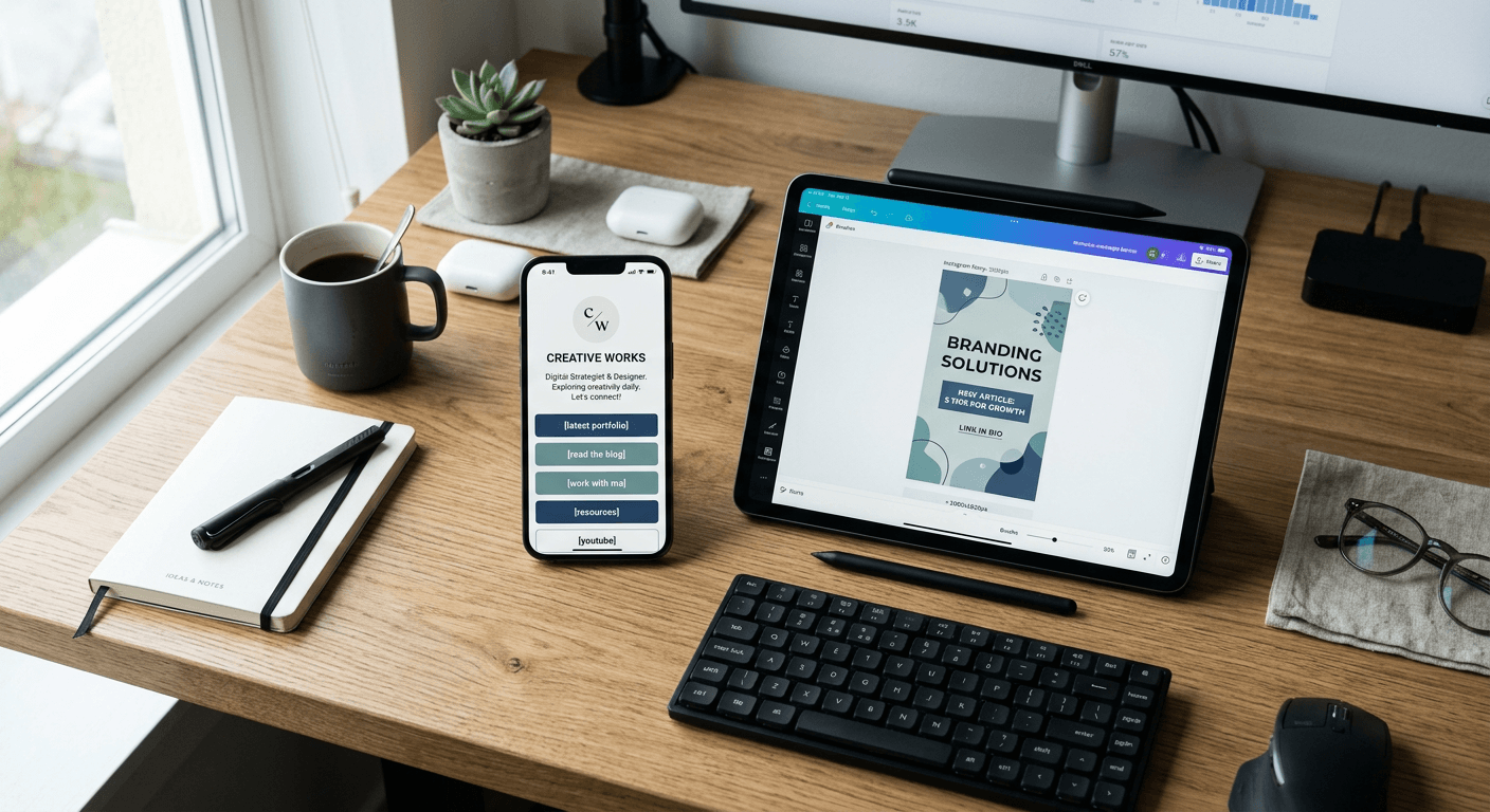
Developing a cohesive visual language is essential for any professional or business looking to establish authority in the digital space. Effective social media design hinges on the strategic alignment of colour palettes, typography, and imagery, ensuring that every touchpoint a potential customer encounters reinforces the same core identity. By standardising your approach to visual communication, you transform fragmented content into a recognisable brand presence.
Quick Summary {#quick-summary}
Social media design is the process of creating visual assets that align with a brand’s unique identity to build trust and recognition. Achieving consistency requires a structured framework for managing typography, colour, and layout across all platforms.
- Define a clear brand style guide.
- Use consistent templates for recurring content.
- Prioritise high-quality, scalable visual elements.
- Audit and refine assets regularly.
Table of Contents {#table-of-contents}
- Quick Summary
- Establishing Your Visual Brand Identity
- Designing Effective Social Media Assets
- Standardising Your Social Media Post Design
- Optimising Social Media Banner Layouts
- Managing Social Media Vectors and Graphics
- Integrating Social Media Business Cards
- Common Pitfalls & Troubleshooting
- FAQ
- Recommended Reads

Establishing Your Visual Brand Identity {#establishing-your-visual-brand-identity}
Before creating individual graphics, you must document your brand's visual constraints. This involves selecting a primary and secondary colour palette that evokes the desired emotional response from your audience. In the UK market, professionalism is often conveyed through balanced, clean design choices. Ensure your palette includes specific hex codes to prevent colour shifting across different screens and devices.
Typography is equally critical. Select two, or at most three, typefaces: one for headings and one for body text. Consistency in font hierarchy creates an intuitive reading experience, allowing followers to instantly associate a specific look with your brand. Using a centralised hub for your digital presence can help you maintain these design standards across every link and interface you share.
Designing Effective Social Media Assets {#designing-effective-social-media-assets}
Social media assets encompass everything from profile pictures to story backgrounds. When designing these, keep accessibility in mind. High contrast between text and background, combined with readable font sizes, ensures that your message is received by all users, including those with visual impairments.
Focus on modularity. Design elements should be easily swappable, allowing you to update information without having to redesign the entire layout. By creating a master project file containing your brand's core components, you ensure that future assets are built on a foundation of established quality rather than being created from scratch every time.
Standardising Your Social Media Post Design {#standardising-your-social-media-post-design}
Recurring content, such as weekly tips or product showcases, requires a templated approach. Use grid systems to maintain alignment and white space, which prevents clutter. When you standardise your post design, you reduce the cognitive load for your audience, making your content easier to scan and engage with during their daily scrolling.
Tools such as Canva marketing suites allow you to build templates that host your specific fonts and colours. While these tools are convenient, they are only effective if you adhere strictly to your style guide. Avoid the temptation to use every new filter or trending effect; instead, apply your brand's filters to ensure the content feels native to your page.
Optimising Social Media Banner Layouts {#optimising-social-media-banner-layouts}
Banners serve as the 'shop window' for your profile. Because platforms use different aspect ratios for headers on mobile and desktop, your design must be flexible. Always place your key branding or call-to-action elements within the 'safe zone' - the centre of the banner - to avoid them being cropped on mobile displays.
Keep your banner design minimalist. It should serve as a high-level introduction to your brand rather than a detailed list of services. Use the available space to establish mood and credibility. If you are an online shop or freelancer, your banner should communicate exactly what you offer within three seconds of a user landing on the page.
Managing Social Media Vectors and Graphics {#managing-social-media-vectors-and-graphics}
Vectors are essential for high-quality social media graphics because they can be scaled to any size without losing clarity. Using SVG or high-resolution PNG formats for logos and icons ensures your brand appears crisp on high-DPI displays. Never stretch or distort raster images; if an image cannot be resized to fit the required dimensions, it is better to crop it or source a higher-quality version.
Organise your library of icons and brand shapes in a folder structure that is accessible to everyone on your team. This prevents 'brand drift,' where subtle changes in design style accumulate over time, eventually resulting in a brand identity that looks fragmented and unprofessional.
Integrating Social Media Business Cards {#integrating-social-media-business-cards}
Digital business cards serve as the modern bridge between your social profile and professional networking. Ensure that the design of your digital card mirrors your social media aesthetic. The transition from your Instagram grid to your digital business card should feel seamless to the user.
Focus on clarity. Include essential information such as your name, title, and a single, direct link to your main bio page. Cluttering a digital business card with too many links often leads to decision paralysis for the recipient. Keep the design lean and ensure the QR code is generated with enough contrast to be scanned instantly by any camera app.
Common Pitfalls & Troubleshooting {#common-pitfalls-&-troubleshooting}
One frequent error is inconsistent font usage across different platforms. If you use a bold serif font on LinkedIn but a thin sans-serif on TikTok, your brand recognition will suffer. Rectify this by verifying your style guide every time you launch a new channel.
Another common issue is file format mismanagement. Uploading low-resolution JPGs that appear blurry is a quick way to undermine your credibility. Always export your assets at the highest recommended quality settings for the specific platform, and ensure that your file naming convention is descriptive (e.g., 'Brand_Banner_Summer2026.png') to avoid confusion in your storage system.
FAQ {#faq}
How often should I audit my social media design? Perform a comprehensive audit every six months. Check that your colours, fonts, and imagery still represent your current business goals and values.
Do I need a professional designer for every post? No. By building a robust set of templates and a defined brand style guide, you can handle most daily content in-house while using a professional designer for major campaign assets.
What is the best way to ensure my designs look good on mobile? Always test your designs on a mobile device before publishing. Remember the 'safe zone' rules for banners and use large, legible typography for images intended for smaller screens.
How do I make my brand stand out without following every trend? Focus on quality and authenticity. While trends can be useful, a consistent, high-quality aesthetic that reflects your actual business personality builds more long-term trust than chasing ephemeral design fads.